 |
|||
| 目
錄 Contents |
|||
| C0600100500A | C0601502401A, 2B | C0602804500A | C0700100300A |
| C0600302100A | C0601607401A, 2B | C0602908600A | C0700202400A |
| C0600402500A | C0601709401A, 2B | C0603008300A | C0700407300A |
| C0600508700A | C0602003501A, 2B | C0603105400A | C0700500300A |
| C0600605500A | C0602102600A | C0603203500A | C0700602400A |
| C0600708300A | C0602200700A | C0603302400A | C0700708500A |
| C0600906300A | C0602300600A | C0603405400A,
C0603705400A |
C0700806300A |
| C0601008400A | C0602408500A | C0602608200A | C0700903300A |
| C0601108300A | C0602505300A |
C0603510000A | |
| C0601205500A | C0602703500A | C0603610000A | |
| C0601409501A,
2B |
|||
|
|
|||
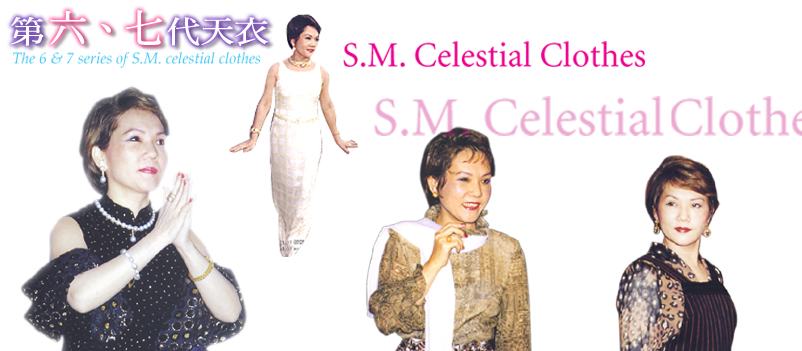
色彩的調配 Combination
of Colors |
|||
|
清海無上師喜用亮麗的色彩,甚至黑色也採用光亮、飽和的黑。在裡襯的選用亦復如是,裡布往往比外面的布更搶眼,迭有令人驚艷的效果,正是從裡面「亮」出來。而對比配色方面,更是清海無上師慣用的色彩語言,例如綠色長襯裙以淺藍裡布,更顯清亮新穎;寶藍色禮服配上雪白襯裡,出落得無比純潔大方。其他像雪紡紗的色系搭配,一般設計師大多會採用較深沉的同色系,清海無上師卻反其道運用搭配以輕亮的顏色。在如此恣意與巧思之間,S.M.天衣著實擺脫了所謂風格與趨勢的桎梏。 The Supreme Master Ching Hai prefers to use bright colors. If black is necessary at all, a shinier, more saturated shade is chosen. When using Chiffon as the base fabric, for example, most designers prefer to combine different shades of a dark color, but the Supreme Master Ching Hai does exactly the opposite by selecting a light color. In addition, the linings tend to outshine the outer layers of the clothing, with an intention to emphasize the true radiance that comes from within. The use of contrasting colors is yet another aspect of the Supreme Master Ching Hai's esthetic expression. Examples include a long green skirt with a light blue lining to create brightness and vigor, and an ocean-blue dress with a white lining to signify purity. |
|||